

In the real estate sector, first impressions don't just catch the eye — they speak directly to the subconscious. However, a common mistake is thinking that color selection is purely a graphic design exercise. The reality is that a successful color strategy is not just about corporate branding, but about how this palette communicates the reality of the entire project: its geographical location, the construction materials used, and the promised lifestyle.
Color as an Extension of Architecture
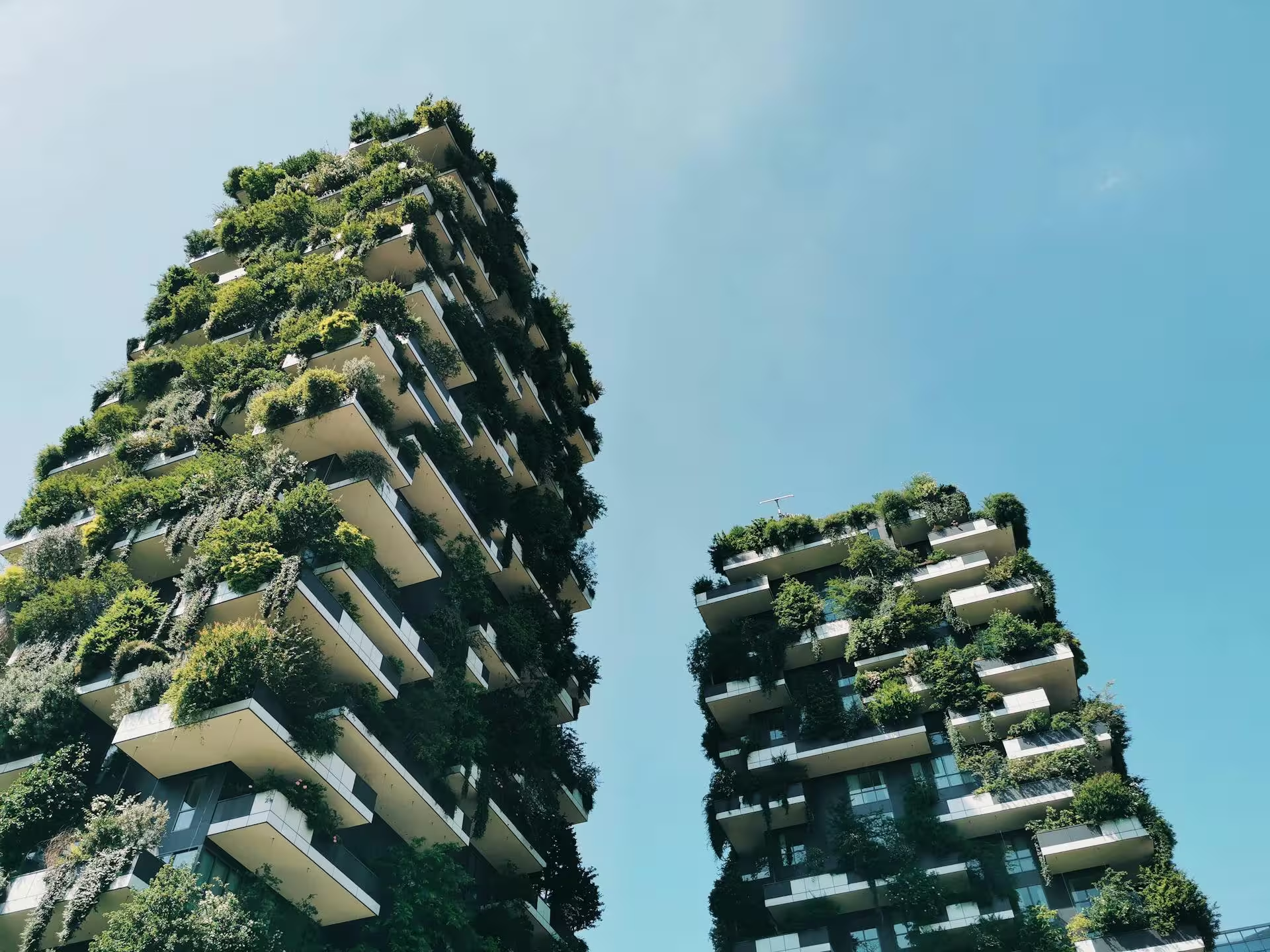
The colors of your sales collateral must be an honest reflection of the physical construction. If a project stands out for its use of natural woods, exposed concrete, and large windows surrounded by greenery, the digital palette must anchor the user in that same tactile experience.
- Sand, Terracotta, and Soft Greens: Generate an immediate connection with nature, sustainability, and well-being. They are the gold standard for "Reserve" type projects, eco-resorts, or low-density suburban homes.
- Black, Gold, and Charcoal: Convey elegance, exclusivity, and financial solidity. Ideal for corporate skyscrapers or penthouses in the financial district.
- Deep Blues and Grays: Evoke security, trust, and professionalism, widely used by investment funds and institutional developments.
Emotional Buyer Segmentation
Different demographic profiles respond to distinct visual stimuli. Younger investors (Millennials and Gen Z) tend to gravitate towards brands with clean, minimalist palettes featuring vibrant accents that suggest innovation and technology (Smart Homes). On the other hand, the traditional luxury market, composed of high-net-worth buyers, seeks sobriety and timelessness.
"Choosing the right colors is not a matter of personal taste. It is a business decision."
— Jenifer Grillo, Brand Strategy Director, Owly
Conclusion
When the visual identity is perfectly aligned with the architectural vision and the buyer's profile, the project ceases to be just a building on a blueprint and becomes a brand of desire.
Share this article


This article perfectly captures why so many real estate brands fail — they choose colors they like personally rather than colors that reflect their project. We made this mistake with our first development and the brand felt completely disconnected from the architecture.
The generational segmentation point is fascinating. We recently repositioned a mid-range development toward younger buyers and the palette shift from muted neutrals to crisp whites with electric blue accents made a remarkable difference in engagement on social media.
The terracotta and soft green palette description immediately made me think of our eco-resort project. We had been gravitating toward those tones intuitively — it's great to see the psychology behind what we were doing instinctively.